A home care website needs more than a polished design. Learn how the right website structure can help families find the right care, trust your agency, and take action.
A home care website can look professional, modern, and expensive — and still fail to generate inquiries.
That is one of the biggest differences between building a website for a home care agency and building a website for a typical local business.
A generic business website can sometimes get away with a simple structure:
Home → About → Services → Contact
For a home care agency, that structure may not be enough.
The person visiting your website may not even be the person who needs care.
It might be a daughter looking for help for her mother.
It might be a husband trying to understand whether his wife needs in-home care.
It might be an adult son searching after his father has returned home from the hospital.
And often, they don't know exactly what service they need yet.
They are simply trying to figure out:
"Can someone help my family?"
That changes the way the website should be designed.
A good home care website should not just explain who your agency is. It should help a visitor understand their situation, find relevant information, feel comfortable with your agency, and know what to do next.
This is where specialized home care website design becomes different from simply putting a home care business into a generic website template.
The Visitor May Not Know What Service They Need
This is something that is easy to overlook when planning a home care website.
Agencies often organize their websites around the services they provide:
- Personal Care
- Companion Care
- Respite Care
- Dementia Care
- Senior Care
- 24-Hour Care
- Home Health Care
That makes sense from the agency's perspective.
But the person searching may not use those terms.
They might search:
"Someone to help my elderly mother at home"
Or:
"Help for elderly parent after hospital"
Or:
"Caregiver for dad at home"
Or:
"Help with bathing for elderly"
The visitor is describing a situation, not necessarily a service.
A good website needs to connect those two things.
For example:
Situation:
"My mother is struggling to manage everyday tasks."
Possible need:
Personal care and assistance with daily living.
Website content:
Explain what personal care includes, who it may help, and what an initial conversation looks like.
Next step:
"Talk With a Care Advisor"
That feels much more natural than forcing someone to figure out your service structure before they can find an answer.
Your Homepage Should Answer Questions - Not Just Introduce Your Company
One of the most common mistakes in home care web design is making the homepage too focused on the agency.
You might see something like:
"Welcome to ABC Home Care. We are a trusted provider of quality care with compassionate caregivers and years of experience."
There is nothing necessarily wrong with that statement.
The problem is that it doesn't answer the visitor's immediate questions.
Within a few seconds, someone should be able to understand:
- Who do you help?
- Where do you provide care?
- What types of care do you offer?
- Why should they trust you?
- What can they do next?
For example, instead of beginning with a vague headline such as:
"Compassionate Care You Can Trust"
a more useful headline might be:
"In-Home Care for Seniors Across [Service Area]"
Then the supporting copy can explain what the agency actually provides and who it is designed to help.
The goal isn't to make the headline sound clever.
The goal is to remove uncertainty.
Home Care Is Local, So Your Website Has to Be Local
Home care is not an industry where someone usually searches for a provider anywhere in the country.
Families generally need an agency that can actually serve their location.
That means location should be part of your website's information architecture.
Your website should make it easy to understand:
Where you provide care + what type of care you provide.
For example:
- Home Care in Miami
- Home Care in Fort Lauderdale
- Personal Care in Boca Raton
- Senior Care in Orlando
But there is an important difference between creating useful local pages and creating dozens of pages simply because a keyword tool suggested another city.
A page shouldn't exist only because you want to rank for:
"Home Care + City Name."
It should provide something useful to someone who actually lives in that location.
A good location page can explain:
- The areas you serve
- Available services
- How your care process works
- Local contact information
- Relevant testimonials
- Questions families in that area may have
- How to get started
If every city page contains the same paragraph with the city name changed, the website isn't really becoming more useful.
It's just becoming bigger.
Don't Put Everything on One "Services" Page
Another issue we frequently see with generic website structures is putting every service onto one page.
The page might contain:
Our Services
Personal Care | Companion Care | Respite Care | Dementia Care | Senior Care | Alzheimer's Care | Transportation
Each service gets two or three sentences.
That creates a page that technically contains the information, but doesn't necessarily help someone who wants to understand one particular type of care.
If a service is important to the agency's business, it may deserve its own useful page.
For example:
Personal Care
Explain what personal care means, what assistance may include, who it is intended for, and what families can expect.
Companion Care
Explain companionship, social support, daily routines, and the situations where companion care may be appropriate.
Dementia Care
Explain the type of support available, how caregivers work with families, and what someone should consider when looking for dementia-related care.
The important point is not simply having more pages.
It's giving each important topic enough space to actually answer the visitor's questions.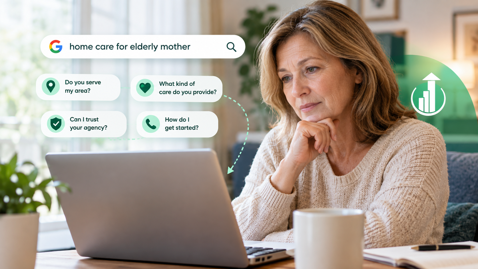
A Beautiful Website Doesn't Automatically Create Leads
Good design matters.
A website that looks outdated can absolutely affect trust.
But there is a difference between looking professional and helping someone make a decision.
Imagine two websites.
Website A has:
- Beautiful animations
- Large photography
- Modern typography
- Smooth transitions
- Stylish buttons
But the visitor can't quickly figure out whether the agency serves their city.
Website B is simpler.
But immediately it tells the visitor:
Who the agency helps → Where it operates → What care is available → How to speak with someone
For a family trying to find care, the second website may be much easier to use.
The best home care website design isn't necessarily the website with the most visual effects.
It's the one that makes the next decision easier.
Your CTA Should Match What the Visitor Is Actually Thinking
"Contact Us" isn't wrong.
But it is often too generic.
Think about what a family member may be feeling when they reach your website.
They may not be ready to "contact a company."
They may simply want to understand their options.
That's why CTAs such as these can feel more relevant:
- Talk With a Care Advisor
- Discuss Care Options
- Ask About In-Home Care
- Speak With Our Team
- Find Out If We Can Help
- Request a Care Consultation
Of course, the CTA should match what the agency actually offers.
Don't promise a "free consultation" if there isn't one.
Don't say "Get Care Today" if the agency needs an assessment first.
The website should set an accurate expectation about what happens after the visitor clicks.
Don't Turn the Contact Form Into an Intake Interview
A website visitor who is contacting you for the first time probably doesn't need to complete a 20-question form.
Long forms can create unnecessary friction.
For the first interaction, ask only for information the agency genuinely needs.
For example:
- Name
- Phone
- Location
- Brief description of what they need
That's often enough to start a conversation.
The exact fields depend on the agency's process, but the principle is simple:
The first step should feel easy.
The W3C's accessibility guidance also recommends asking only for information that is necessary and keeping forms clear and usable.
Mobile Design Isn't an Optional Extra
A large percentage of people will encounter a home care website from a phone.
And mobile visitors aren't always sitting at a desk calmly comparing providers.
Someone might be searching while sitting beside a parent.
They might be looking for information after receiving a hospital discharge recommendation.
They might be trying to call an agency while driving as a passenger.
The website therefore needs to make basic actions easy.
On mobile:
- Phone numbers should be easy to find.
- Buttons should be large enough to tap.
- Text should be readable without zooming.
- Forms should be simple.
- Navigation should be predictable.
- Important information shouldn't be hidden behind unnecessary interactions.
Accessibility is part of good web design, not something that should be added after the website is finished. W3C guidance covers areas such as readable content, keyboard access, clear navigation, labels, and identifiable interactive elements.
Trust Should Be Shown, Not Just Claimed
Almost every home care website says something like:
"Our caregivers are compassionate, trustworthy, and experienced."
The problem is that every agency can say the same thing.
Instead of only telling visitors that your agency is trustworthy, show them how your agency works.
For example:
Caregiver Screening
Explain the actual screening or hiring process if the agency has one.
Caregiver Training
Explain relevant training requirements or ongoing education.
Care Planning
Show how care needs are discussed and how families are involved.
Communication
Explain who families can contact when they have questions.
Reviews
Display genuine reviews where appropriate.
Certifications or Memberships
Show legitimate certifications, licenses, memberships, or affiliations — but only where they are accurate and current.
Trust becomes much stronger when visitors can see evidence behind the claim.
Tell People What Happens After They Contact You
One small section can remove a surprising amount of uncertainty:
What Happens Next?
For example:
1. Tell Us What You Need
Have a conversation with the agency about your family's situation.
2. Discuss Care Options
The agency explains the available services and whether they may be appropriate.
3. Create a Care Plan
If the agency is a fit, the next steps for arranging care are explained.
4. Begin Care
The agency coordinates the start of services.
The exact process will vary from one agency to another.
That's why this section should describe the real process, not a generic four-step marketing funnel.
People are often more comfortable taking the first step when they know what will happen afterward.
SEO Should Follow the Website Structure - Not Control It
SEO is obviously important for a home care website.
You want potential clients to find your agency when they search for relevant services and locations.
But building a website around a spreadsheet of keywords can create a poor experience.
For example, you might identify:
- Home Care Miami
- Home Care Services Miami
- Senior Home Care Miami
- Home Care Agency Miami
- In-Home Care Miami
That doesn't mean you need five nearly identical pages.
Instead, think about the questions behind those searches.
What does someone actually want to know?
Can you provide care in my area?
What type of care do you provide?
Can you help someone with dementia?
How much support can you provide?
How do I get started?
A website that answers those questions clearly can have a much stronger foundation than one created around keyword variations alone.
Internal Links Should Help Visitors Move Forward
Internal linking is important for SEO, but it should also make sense to a real person.
If you're discussing personal care, linking to the relevant personal care page makes sense.
If you're explaining a local service area, linking to the location page makes sense.
If you're talking about choosing an agency, linking to your care process or about page may make sense.
The anchor text should tell the visitor what they will find.
Instead of:
Click Here
use something meaningful such as:
Learn more about our personal care services
or:
See the areas where we provide in-home care
That helps both visitors and search engines understand the relationship between pages.
External Links Should Add Real Value
Not every article needs ten external links.
Adding links simply to make a page look "SEO optimized" isn't the goal.
External links are most useful when they help the reader verify or understand something.
For example, if you're discussing accessibility standards, linking to the W3C can give readers a reliable reference.
If you're discussing a government program, link to the appropriate government source.
The same principle applies throughout your website:
Link because the resource is useful, not because you need another link.
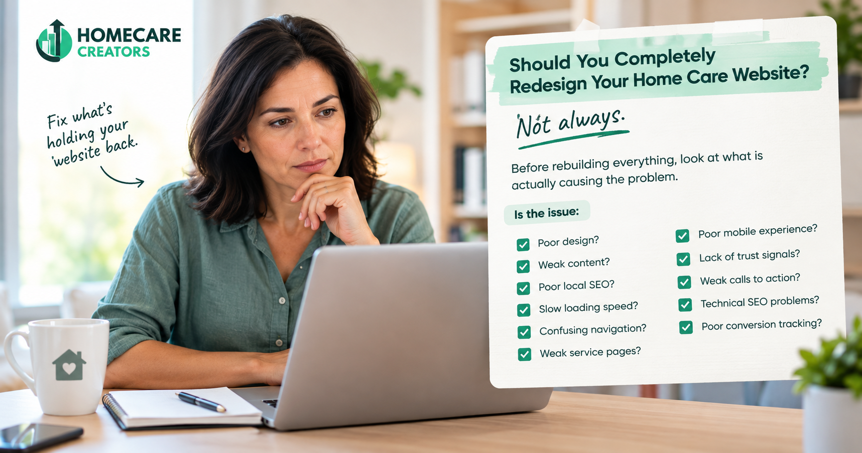
Should You Completely Redesign Your Home Care Website?
Not always.
A new website isn't automatically the answer.
Before rebuilding everything, look at what is actually causing the problem.
Is the issue:
- Poor design?
- Weak content?
- Poor local SEO?
- Slow loading speed?
- Confusing navigation?
- Weak service pages?
- Poor mobile experience?
- Lack of trust signals?
- Weak calls to action?
- Technical SEO problems?
- Poor conversion tracking?
Sometimes an agency has a perfectly usable website but needs better service pages and local SEO.
Sometimes the content is strong but the design makes it difficult to navigate.
Sometimes the website looks good but almost nobody can find it through Google.
And sometimes the whole structure needs to be rebuilt.
The right answer starts with diagnosing the problem rather than automatically selling a redesign.
A Simple Test for Your Home Care Website
Open your website as if you have never seen it before.
Don't think like the owner.
Think like the daughter of an elderly parent who needs help.
Then ask:
1. Do I immediately know what this company does?
If not, the homepage needs more clarity.
2. Do I know where they provide care?
If not, location information needs to be easier to find.
3. Do I understand what type of help they offer?
If not, your service structure may need work.
4. Do I have a reason to trust them?
If not, look beyond generic claims and show real evidence.
5. Do I know what happens if I contact them?
If not, explain the next step.
6. Can I easily contact them from my phone?
If not, the mobile experience needs attention.
This test is simple, but it can reveal problems that a visual redesign alone won't fix.
What Makes a Home Care Website Different?
The biggest difference isn't that a home care website needs a particular color, layout, or WordPress theme.
It is the decision the website needs to support.
A typical business website may be trying to convince someone to buy a product or book a service.
A home care website is often helping a family make a decision that feels much more personal.
They may be worried.
They may be uncertain.
They may not know what service they need.
They may be comparing several agencies.
And they may be trying to make the right decision for someone they love.
That's why the website needs to provide more than information.
It needs to provide clarity.
Final Thoughts
A successful home care website doesn't need to look completely different from every other website on the internet.
It needs to work differently.
Instead of starting with:
"What pages should our website have?"
start with:
"What is a family trying to figure out when they arrive here?"
From there, the structure becomes much easier to build.
They need to know whether you can help.
They need to know whether you serve their area.
They need to understand the services you provide.
They need reasons to trust your agency.
And they need to know what happens when they take the next step.
That is the real difference between a generic website and effective home care website design.
The goal isn't simply to create a website that looks professional.
The goal is to create a website that helps the right family find the right information at the right moment — and makes it easier for them to start a conversation.
Looking at Your Home Care Website?
If you're not sure whether your current website is helping families find your agency, understand your services, and contact your team, a website audit can uncover the issues that may be holding it back.
At Homecare creators, we look at the website from both sides: the experience a family has when visiting the site and the SEO structure that helps people find it in the first place.
Want to see what's holding your website back?
Ready to dominate local search in your Florida market?
Get a free SEO audit — we'll show you exactly where you're losing clients to competitors.